Stop Squinting: Why Stage Design is About More than Just Fonts
Stage lights are bright and screens are far away. Learn how we designed StageClock to be readable even in the toughest venue conditions.
Table of Contents
If you put a regular website on a stage monitor, it’s going to be unreadable. Between the glare of the spotlights and the distance to the speaker, all those pretty colors and small fonts just disappear.
When we built StageClock, we didn't design it for a laptop screen. We designed it for the back of a dark ballroom.
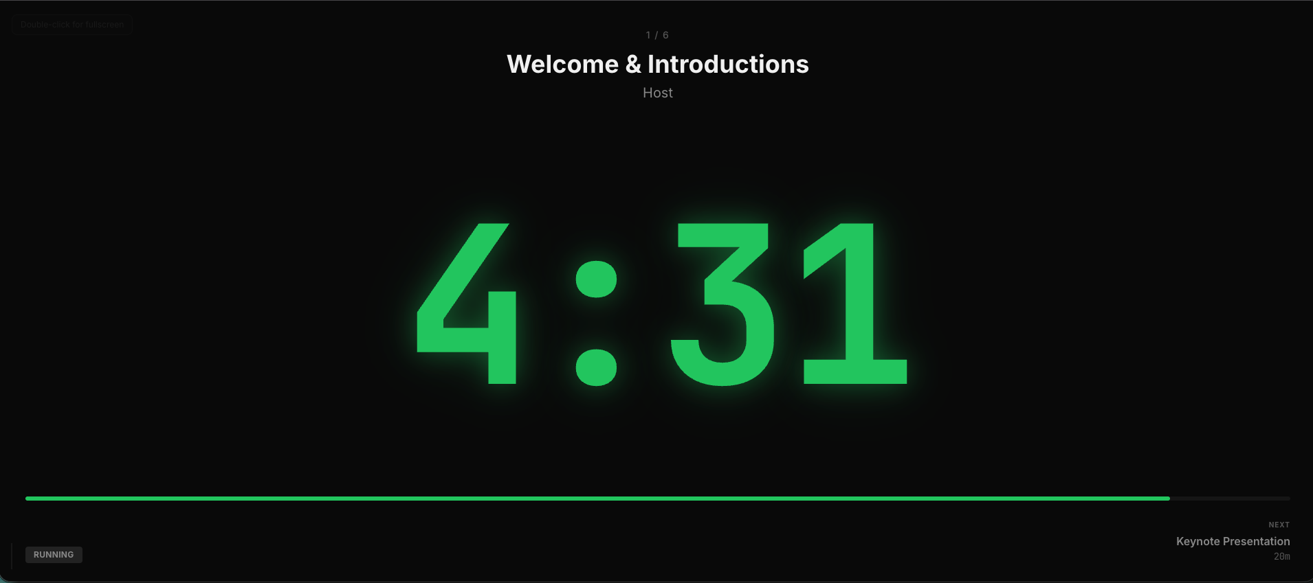
Pure black, glowing green. This is the gold standard for stage visibility.
The "20-Foot Rule"
Everything in the StageClock Display View has to pass the "20-foot rule." Can a speaker with average eyesight read the remaining time from 20 feet away? If the answer is no, we change the design.
- Extreme Contrast: We use pure black and neon colors. No gradients, no shadows, no distractions.
- Dynamic Sizing: The numbers automatically stretch to fit the screen. Whether you're on a 13-inch iPad or a 60-inch LED wall, the clock fills the space.
- Color Over Text: We prioritize color changes (Green -> Yellow -> Red) because your brain recognizes a color shift much faster than it reads a number.
Why This Helps You
A readable timer means a confident speaker. A confident speaker means a better show. By taking the guesswork out of the visual design, StageClock makes sure that everyone—regardless of their eyesight or the lighting in the room—can stay perfectly on time.
Don't let your speakers squint. Experience the most readable stage timer today.